Showing posts with label color inspiration. Show all posts
Showing posts with label color inspiration. Show all posts
Wednesday, October 21, 2015


Saturday, December 3, 2011
The Feel of Color: Calm
Creating a calming living environment like stated in the last post we need to keep it simple. It makes sense when you think about it. When walking into a spa do you see a lot of different vibrate colors? Do you see lots of accessories lining the room? Do you see complicated pieces of art? Most likely you are going to answer no to all these questions.
Lets start building our room with color. Greens, blues, creams and troupes are all colors that are used to create a calming atmosphere. All these colors work well together but remember the 10-30-60. The primary color should be 60% of your room, the secondary color should be 30% and the accent color should be 10% of the room.
Lets start building our room with color. Greens, blues, creams and troupes are all colors that are used to create a calming atmosphere. All these colors work well together but remember the 10-30-60. The primary color should be 60% of your room, the secondary color should be 30% and the accent color should be 10% of the room.
Now we need a jumping off point, a piece of inspiration. Lets go shopping!
Here are some Calming themed inspirational pieces that I have found on Etsy.
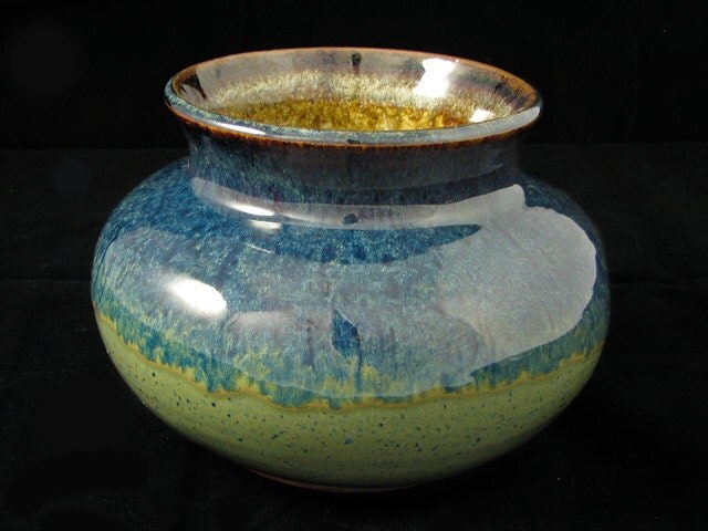 |
Blue/Green Vase |
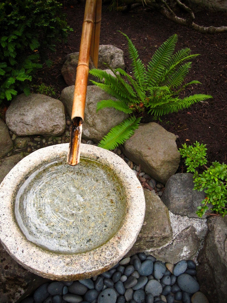 |
Japanese Fountain Photography - 6x8 Original Fine Art Photograph Zen Water Stones Bamboo Drip Garden Calming Relaxing Meditation |
 |
Summer Calm - Original Painting - 24x24 on gallery wrapped canvasPlease do not steal any of the artwork featured in this blog. These are original creations create by true artists. Please be respectful and purchase their work from them directly by following the links below each picture.Next time I will pick one of these items and build a room off of them. Comment below to help me choose which inspiration piece and which room in the house to design! |
Thursday, November 3, 2011
The Feel of Color
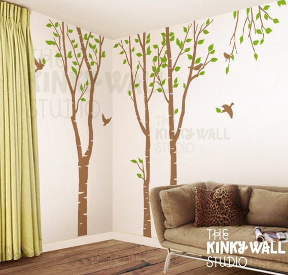 |
| Tree Wall Decal Sticker |
Do you want to be calmed? Excited? Sexy? Clean? Warm? Inviting?
Let's start with calm and clean. To achieve this with color you would want to choose a monochromatic or analogous color scheme. Calm in design equals simple. Keep it simple and you will feel the calm. When it comes to choosing color, pick cool colors: blue, green, purple. A great tip when choosing your color in a monochromatic scheme, go to the paint store and pick out a paint swatch of a color you love and then carry it everywhere! The colors around your favorite color on that swatch are shades, hues and tones that will work great with your main color.
Now lets move onto inviting. An inviting feel can be achieved with most colors but its how you apply your color that makes it inviting. Analogous color schemes lend themselves to being inviting. Adding a little bit of interest by moving to the color to right or left on the color wheel creates warmth without being over powering.
Excited feelings come from high interest. Complimentary color schemes create the most interest, purely because they are opposite on the color wheel. The distance between the colors is what adds excitement. Excitement as the eye jumps from one color to the next around the room.
As we start to look at putting rooms together I will get into a little more detail and show you some examples of each. I would love it if you would email me with you questions and comments! aniemandesign@gmail.com
Thursday, October 20, 2011
The Dreaded Color Wheel
The color wheel can be very scary if you have never taken an art or design class before and even at that it can still seem overwhelming. Color theory is, well, like all subjects then end in “theory” intimidating at first but hopefully I can help you sort out the basics.
 Let’s take a look at the color wheel in it’s simplest form. This is the side of the color wheel you will use the most. There are three basic color schemes that most people are drawn to:
The second is an analogous color scheme. This is where you pair your inspirational color with the two directly next to it on the color scheme. So again if orange is our main color we would want to pair yellow-orange and red-orange with it to make an analogous color scheme.
The basics of the color wheel are what can help most home owners get over the first hurdle of color inspiration. Knowing that you like orange is a great start but where people get held up is “what goes with orange (or blue or yellow or whatever your primary color inspiration choice may be). So this is where the color wheel come in handy.
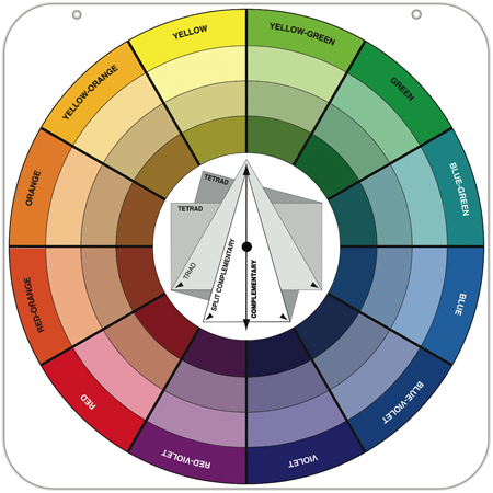
One being a complimentary color scheme. This means that when looking at the color wheel you pair the two colors across from each other. For example orange goes with blue.
The second is an analogous color scheme. This is where you pair your inspirational color with the two directly next to it on the color scheme. So again if orange is our main color we would want to pair yellow-orange and red-orange with it to make an analogous color scheme.
The last one is a monochromatic color scheme. This is the most simplistic you basically pick a color and mix it with tints, shades and tones of itself.
Now that we know what color schemes are its time to choose one. Much of design is based on a feeling. If you follow the rules and use your color wheel when choosing your colors, no matter what you go with it has to relate the feel that you want in your home.
Next week I’m going to go through color and scheme choice, and how it relates to the feel of the room. For next week your home work is to evaluate tha feel that you want from your room!
Monday, October 3, 2011
Color Inspiration
Color can be one of the most challenging components in a design. Many people stumble over putting colors together and either live with their mistakes or avoid color all together.
If you are trying to put together your own home design without a designer the first thing I suggest investing in is a color wheel. You can find them at your local craft and art supply store. (If you don't want to take on the color dilemma yourself I would be more than happy to help you with a color consultation. Email me at animenandesign@gmail.com).
The color wheel can help you match colors whether you are trying to blend blues or using a contrasting color scheme.

You can also find your color inspiration from others designs in magazines or on blogs. Like artist, designers wouldn't be doing what they do if they didn't have a great comprehension of color. If you are interested in keeping up with the latest design trends, design blogs and magazines always showcase the latexes trends in color.

Alright it's time for your homework! Go pick up you color wheel, look through magazines and take a look back on some of my previous blog posts for some color inspirations. If you really feel confused, email me for a color consultation!
Next week I will be tackling the intricacies of the color wheel!
Subscribe to:
Posts (Atom)
Please keep this blog going by placing your ad here:
