 |
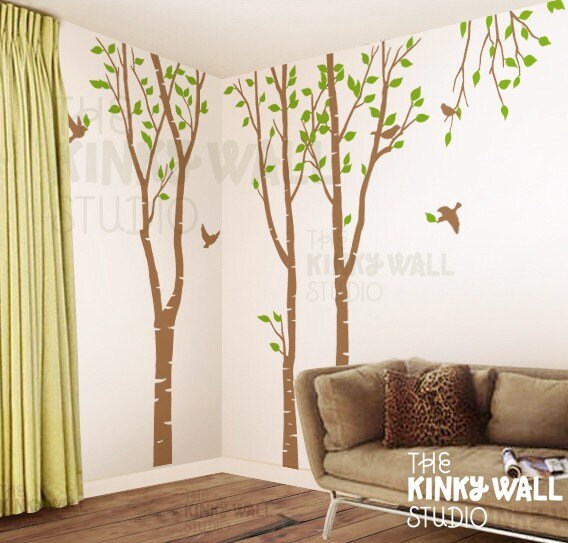
| Tree Wall Decal Sticker |
Do you want to be calmed? Excited? Sexy? Clean? Warm? Inviting?
Let's start with calm and clean. To achieve this with color you would want to choose a monochromatic or analogous color scheme. Calm in design equals simple. Keep it simple and you will feel the calm. When it comes to choosing color, pick cool colors: blue, green, purple. A great tip when choosing your color in a monochromatic scheme, go to the paint store and pick out a paint swatch of a color you love and then carry it everywhere! The colors around your favorite color on that swatch are shades, hues and tones that will work great with your main color.
Now lets move onto inviting. An inviting feel can be achieved with most colors but its how you apply your color that makes it inviting. Analogous color schemes lend themselves to being inviting. Adding a little bit of interest by moving to the color to right or left on the color wheel creates warmth without being over powering.
Excited feelings come from high interest. Complimentary color schemes create the most interest, purely because they are opposite on the color wheel. The distance between the colors is what adds excitement. Excitement as the eye jumps from one color to the next around the room.
As we start to look at putting rooms together I will get into a little more detail and show you some examples of each. I would love it if you would email me with you questions and comments! aniemandesign@gmail.com
No comments:
Post a Comment