Lets start building our room with color. Greens, blues, creams and troupes are all colors that are used to create a calming atmosphere. All these colors work well together but remember the 10-30-60. The primary color should be 60% of your room, the secondary color should be 30% and the accent color should be 10% of the room.
Now we need a jumping off point, a piece of inspiration. Lets go shopping!
Here are some Calming themed inspirational pieces that I have found on Etsy.
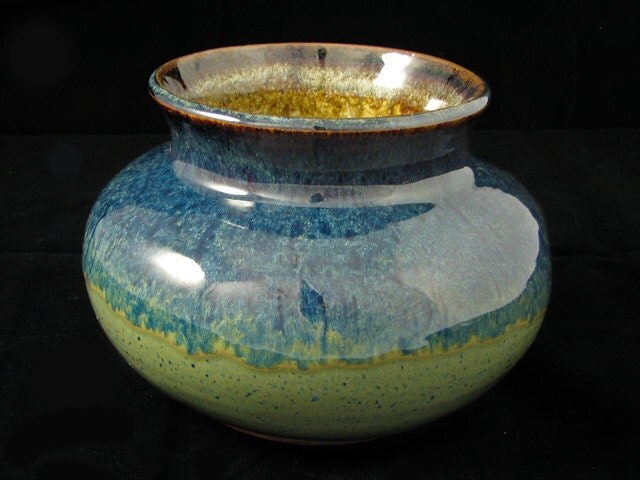 |
Blue/Green Vase |
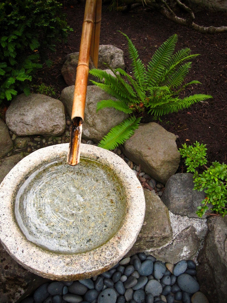 |
Japanese Fountain Photography - 6x8 Original Fine Art Photograph Zen Water Stones Bamboo Drip Garden Calming Relaxing Meditation |
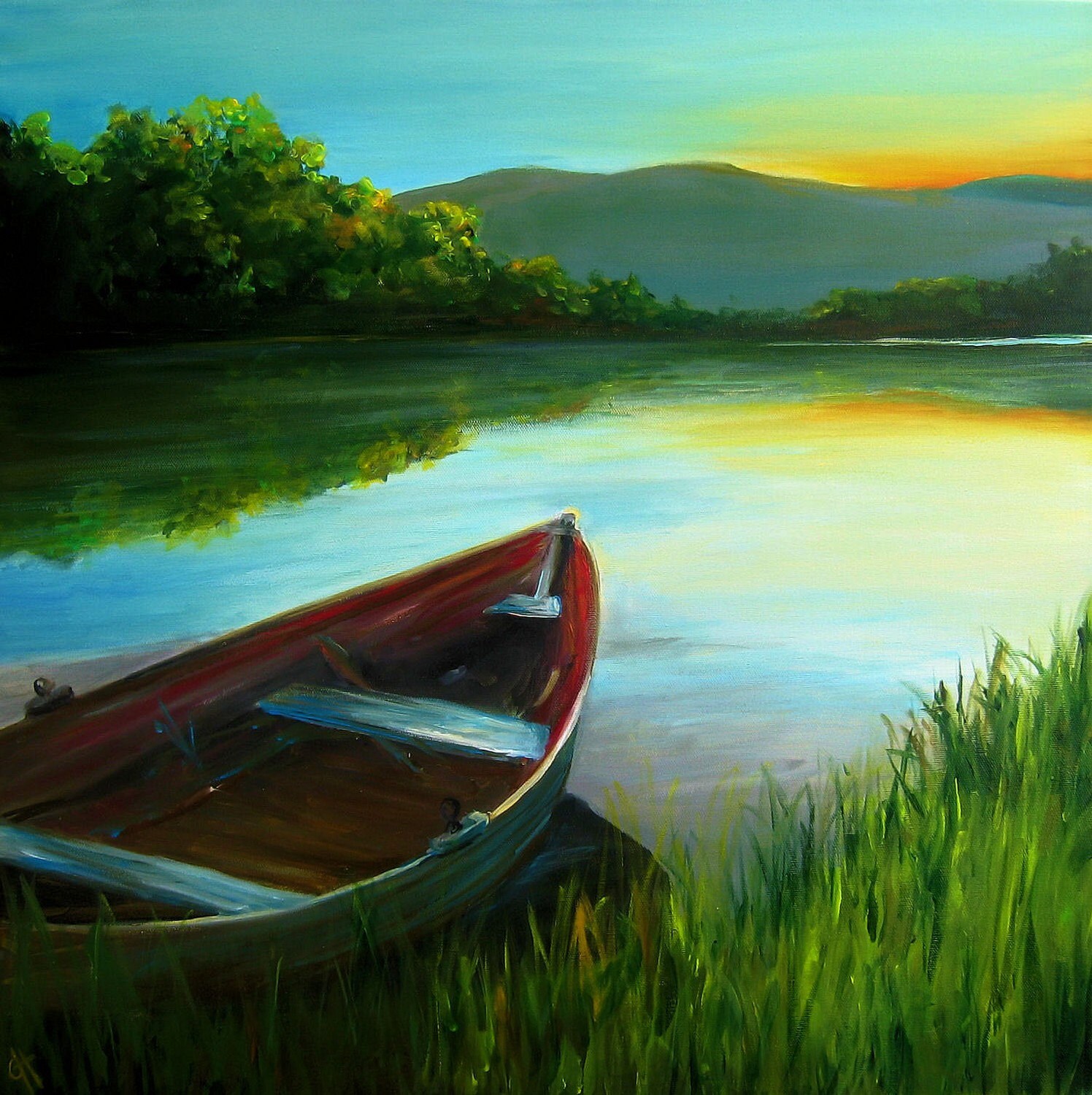 |
Summer Calm - Original Painting - 24x24 on gallery wrapped canvasPlease do not steal any of the artwork featured in this blog. These are original creations create by true artists. Please be respectful and purchase their work from them directly by following the links below each picture.Next time I will pick one of these items and build a room off of them. Comment below to help me choose which inspiration piece and which room in the house to design! |
No comments:
Post a Comment